Photo-Taking Techniques and Ideas in Response to Call for Photo Submissions
(Minghui.org) I would like to share my understandings regarding Minghui’s recent call for photo submissions to commemorate the 30th Anniversary of Falun Dafa’s introduction to the world.
A Note on Equipment and Technique
I do not think we practitioners in mainland China need to buy high-end cameras for the photo submissions. With the cameras we already have or even a cell phone, we should be able to produce nice pictures as long as we have a pure heart and a little understanding of proper techniques.
Several important aspects of photography include theme, creativity, composition, color matching, color contrast, and shooting techniques. We should think about the perspective from which to showcase practitioners’ efforts in validating Dafa and saving people with compassion. By documenting these precious historical moments, we can preserve these records for the future. To achieve that, we need to refer to our equipment manual and other instructions to learn basic methods of color correction and image cropping as well as aperture, shutter, and exposure settings. Through learning professional photography techniques and with continued practice, we should be able to raise our photography to a new level.
A Clear Theme
The first item to consider is a clear theme. Once we are clear about what theme to present, we can plan the scene, lighting, composition, action, contrast, color matching, some props, and so on. The video series, Now and For the Future, for example, shows practitioners’ exercises, daily life, and their preparing materials that expose the persecution. They depicted the perseverance, selflessness, and courage of practitioners in the difficult situation of China. These touching scenes can serve as good examples for all of us.
As an art form, photography comes from life and goes beyond life. By taking advantage of shooting techniques, along with good planning and preparation, we can highlight the theme for a better or even a perfect effect, making the viewers feel as if they’re watching practitioners in action in real time.
There are similarities between photography and painting. By looking at The Art of Zhen, Shan, Ren (Truthfulness-Compassion-Forbearance) International Exhibition, as well as traditional Chinese painting, one can get insights into how to better present a theme. The Art of Zhen, Shan, Ren International Exhibition has a powerful positive energy that can touch people. Below are my comments of some of the artworks.
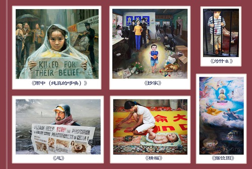
Some of the artworks in The Art of Zhen, Shan, Ren International Exhibition have content that extends beyond the painting itself. The image above shows several examples of the paintings in this collection.
The painting “The Call of Innocence” (first row, left) is a favorite among practitioners. The composition of the girl is a stable triangle. Her eyes, facial expression, even the raindrops on the child’s head are all very eye-catching. The interaction of the foreground and background easily catches people’s attention. The daisy in her hair enriches the image and connects well with the yellow color of her clothing. The inner meaning is profound, since the image not only serves to commemorate and mourn practitioners who have been killed in the persecution, but it also represents determination and the pure heart of the girl, which gives people hope.
"Guard the Treasure" (first row, center) has a diagonal composition running through the stuffed toy, child, practitioner, and the banner on the wall with the Chinese characters for Truthfulness-Compassion-Forbearance. The composition draws attention to the major elements and creates a picture with bright colors and a high degree of saturation. These main characters are in clear contrast to the police officers who have come to arrest the practitioner and ransack her home. The expression and movement of the police officers display their greed, foolishness, and brutality. An officer who found DVDs with Falun Dafa information is eager to report this to his higher official, who, on the other hand, is thrilled to steal the cash, jewelry, watch, and other personal belongings of the practitioner. Two police officers are dragging the practitioner in opposite directions, guiding the viewer to focus on the practitioner. In contrast to the expressions and movement of the police officers, the practitioner displays no anger, hatred, or fear. Instead she just looks at the child calmly. With no police officers watching, the child carries a copy of Zhuan Falun. His innocence and pure heart give people hope. The strong energy field of Zhuan Falun and the child imply blessings from the divine – even after tremendous tribulations, righteousness will prevail. Two stuffed toys, one upright and another lying on the floor, also align with this message.
“Why?” (first row, right) shows two legs chained, with injuries, making people realize that there is much more to the image. The boy's expression and gesture are so touching that they could move one to tears. All of the components of this image highlight the Chinese Communist Party’s brutality against Falun Dafa practitioners.
“Fortitude” (second row, left) shows a man who looks straight ahead with quiet perseverance. The yellow visor adds warmth to the composition, making it more beautiful and providing a three-dimensional effect. The warm colors of the cap, face, and scarf contrast with the cool colors in the background, highlighting the individual. On the poster the man is holding, the monochromatic handling of the torture illustrations contrasts with the word “STOP” in dark red, which draws people’s attention from the man’s face to the poster. The human figure is vertical, while the poster and railing in the background are horizontal, perpendicular to the man, which stabilizes the picture. This vivid picture shows a practitioner’s determination in saving people with compassion despite external hardship.
“Banner” (second row, center) shows a young mother sewing a large Falun Dafa banner with her baby nearby. A basket in the upper right of the image and a smaller sewing basket make a diagonal line across the picture, also creating a light and dark contrast. This visual device enriches the painting with its simple interior scene, warm colors, and harmony. The location and the posture of the mother and her child also illustrate a vivid story that helps people imagine more beyond the painting itself.
“Position” (second row, right) depicts a Buddha dressed in yellow gesturing with his hand toward the interior of the painting while looking outward. The imagery goes beyond this human dimension, illustrating the power of faith. It also reflects the traditional Chinese cultural understanding that “good is rewarded with good, and evil meets evil.”
Shooting Pictures Outside China
People like to see pictures of children, who are innocent, pure, and neat. Many of their positions and movements are funny and cute. We can take pictures of this genre, including young practitioners doing the exercises or accompanying adult practitioners introducing Dafa to people. Young adults are lively, energetic, and relatable. Elderly practitioners, on the other hand, can appear very compassionate and trustworthy. Pictures can be taken within all these age groups, each with their unique stories.
In the composite image above, the first picture on the left in the first row is taken with the ocean in the background and presents a very relaxing scene. Personally, I think the trousers may not be perfect and the clothing could be a little more formal. The first picture on the left in the second row (the woman in green) looks great and the color matches well. The two pictures to the right of that one can draw attention to young people since they belong to the same age group. Some practitioners may know the person in the fourth picture in the second row. He looks trustworthy and a picture of him doing the exercises can also be considered.
The second picture from the right in the first row (the man in white wearing a tie) is not bad, but the light needs correction and the sitting platform is a little too narrow. As to the third picture in the first row, there is not enough space around the practitioner, and the background is also a little cluttered. Plus, this picture is taken as if one is looking down on the subject. I suggest that it would be better to take a picture at eye-level, like the first picture (the man by the ocean). The waves in the fourth picture in the first row (three practitioners meditating together) give a sense of instability. It would be better if the sand were a little smoother to accentuate the peaceful meditation. The color contrast and balance of the sand and the sea is good, though.
All the pictures of children in the third row look good. The second picture is taken as if one is looking up. Maybe this could be corrected. For the candlelight vigil (the third picture from the left), if the candle were a little closer to the faces, it would add some warm tones. In addition, a little blue light from the side might draw a clear contrast between the warm and cool colors.
If it is raining or when taking pictures when looking up, a transparent plastic or glass cover could help protect the camera lens. When there is ground water, shadows on the water or light reflecting from the water could add flavor to the picture, including a sense of depth.
For parades, one could also take pictures of reflections from a mirror or take pictures while on roller skates. It’s important to keep in mind that being ready all the time will help one capture instant, touching expressions or memorable moments.
When the subject is a little far away from the background, one can move the lens closer to a subject to add depth. In addition, one can use close-up, medium-range, and long-range views to create spatial levels. In any case, please pay attention to maintaining a stable composition with contrasts, as well as a good balance of size, color, brightness, cool vs. warm, and sharpness vs. out-of-focus. By taking advantage of the focusing effect of converging lines, we can try different positions and angles of picture-taking to achieve the best result.
Shooting Pictures inside China
The topics can be scenes where practitioners are producing books, materials, or banners indoors. Materials and tools should be neatly placed. It is better to have a color theme with a coordinated warm or cool color. The brightness can go from dark to bright and one can also remove interfering elements from the picture. In addition, one can take pictures of posters and banners.
Practitioners in China should pay attention to safety. For example, we should avoid showing practitioners’ faces or backs, and make sure to cover up any serial numbers on equipment. When a picture is related to printing phrases about Falun Dafa on banknotes, please be careful with serial numbers on the money, and check if the numbers are consecutive. Sometimes banks record such information when people withdraw money, and showing serial numbers in pictures may expose the concerned practitioners and put them in danger. In addition, please note that some reflective materials could also inadvertently leak personal information. Moreover, we should avoid showing anything too individualized, whether furniture or interior patterns, and we should try to use more generic items that do not reveal practitioners’ personal information. If we take pictures of tools made by ourselves for the purpose of producing Minghui calendars, books, or banners, we could paint those tools with other colors afterwards. Plus, the background can be simple curtains, white paper, or carpets.
Another idea is that we could wear clothes we normally do not wear and take pictures of our arms and hands doing things such as printing, sorting, stapling, or packing informational materials in boxes. Besides not being a safety issue, this kind of focus could make the pictures more dynamic. If there is not a good shooting angle, we can add a mirror so that objects, as well as their shadows, could be included in the picture. But please avoid including any person’s portrait in the image.
Backlit shooting can also be explored and it could make the color mild and harmonious. Please avoid taking pictures under direct sunshine at noon. Sometimes, however, a shadow or sunlight can enrich the picture. When the light is weak, some light coming into the room through gaps between blinds or curtains is also good. In addition, we can also use an object’s edge as a foreground to focus the main subject.
It is necessary to minimize the background somewhat to highlight the main subject. Please avoid a cluttered background, so that the design is neat and orderly. Composition, color matching, light and shade contrast, and color balancing are all important.
The above are just some ideas for reference. Regarding size, the size A4 is 210 mm x 297 mm. At 300 ppi, that would be 3508 x 2480. Many cameras are now as high as 3840 x 2160 or 4096 x 2160 (8 megapixels). For pictures used in periodicals, the picture size can be half of A4 or even smaller. In this case, even pictures taken from cell phones should be sufficient.
Below are several examples of pictures taken by practitioners in China, with my personal comments:
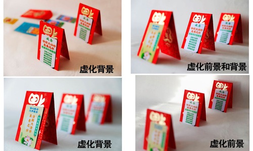
 The two pictures on the left have only a blurred background. The two on the right have blurred foregrounds, which makes them look better.
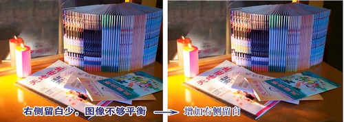
 One more candle was added to the picture on the right, making the layout more balanced.
 A candle was added to the picture on the right, making it more dimensional.
 The picture on the right has a wider “empty space” on the right.
 The picture on the left shows the contrast of warm and cool colors. The picture on the right shows the effect of shadows.
 This picture has not enough space between the subjects and the outer edges of the image.

